
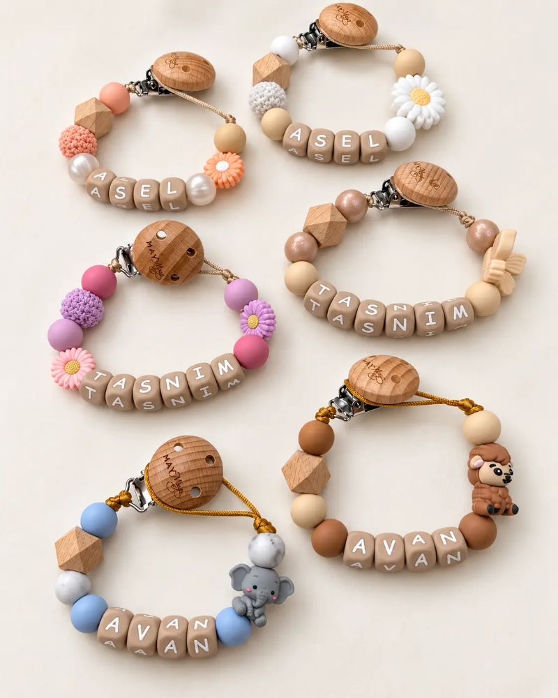
Combining pacifier clip colors: how to choose the best look
Start with the basics: which colors suit a pacifier clip?
The most beautiful pacifier clips are made up of two to four colors that complement each other. When combining pacifier clip colors, starting with a solid base and consciously playing with it almost always results in a calm and stylish look. A pacifier clip is small, so the colors are close together and directly influence each other.
Work with a main color, a supporting color, and a subtle accent
A proven rule of thumb is the 60-30-10 ratio: approximately 60% main color, 30% supporting color, and 10% accent. The main color determines the atmosphere of the pacifier clip. The supporting color adds depth or contrast, and the accent is the little surprise that makes the design personal.
A few examples that work well:
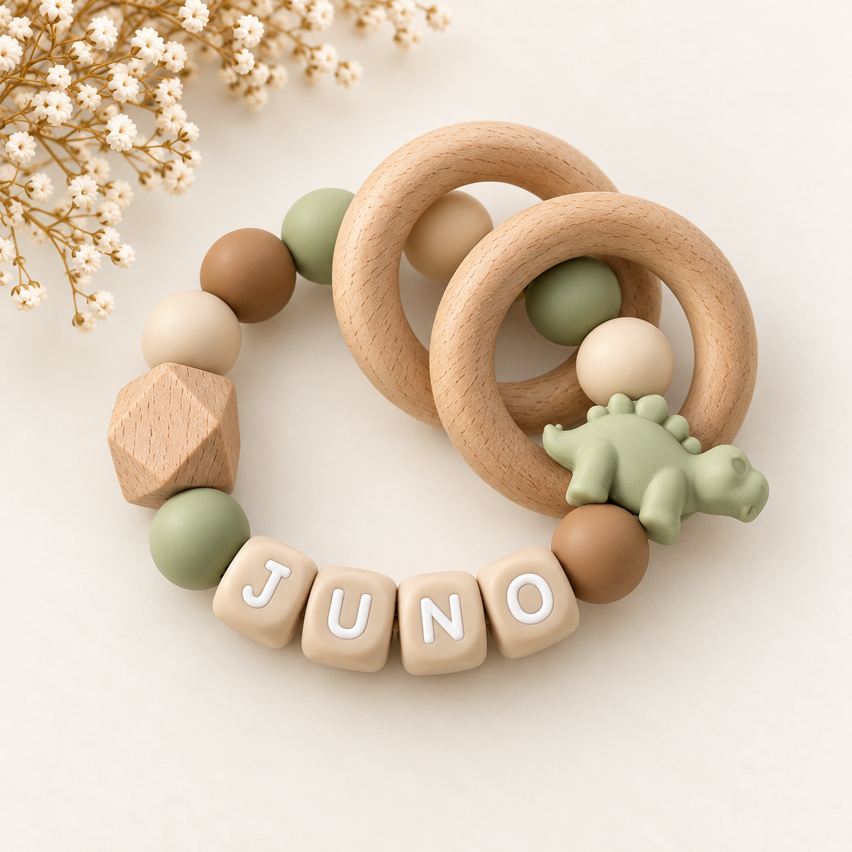
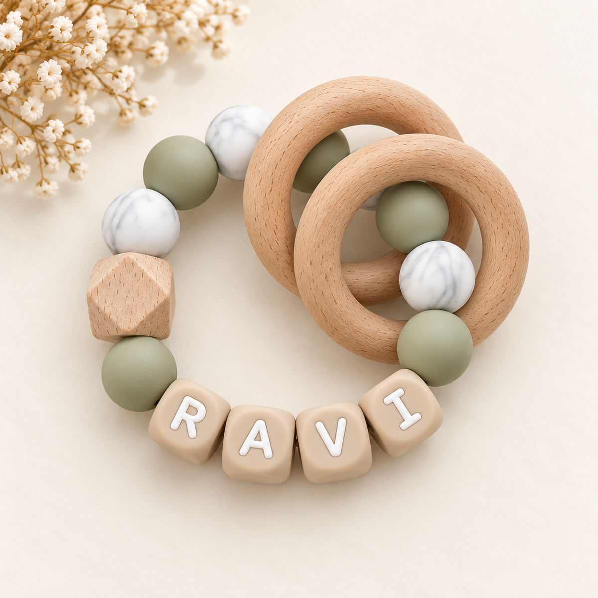
- Main color sand beige, supporting color white, and accent sage green for a soft, natural look.
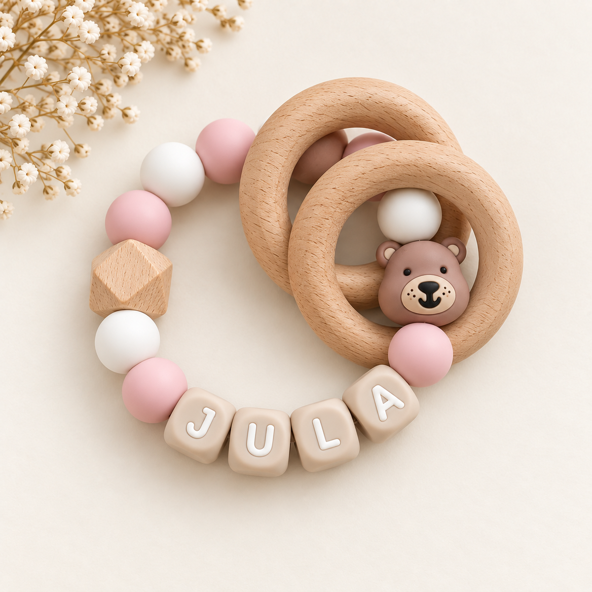
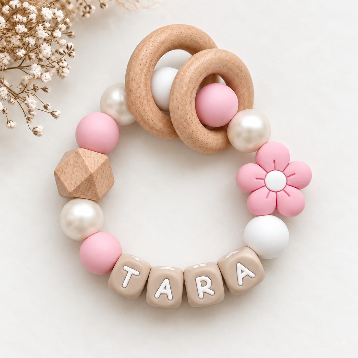
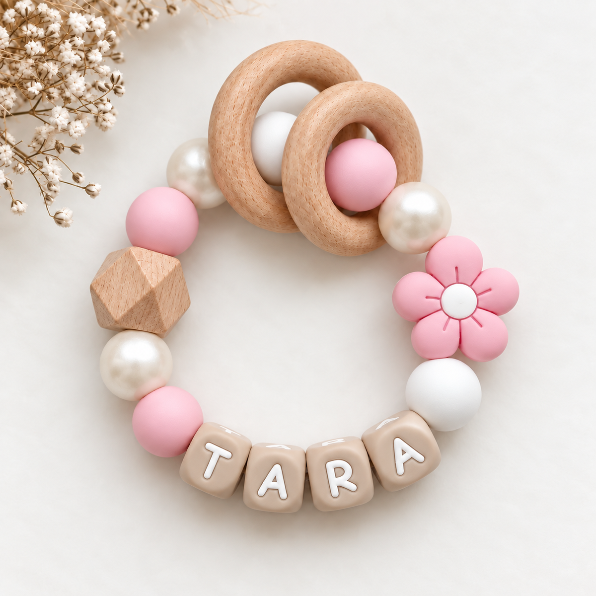
- Main color dusty pink, supporting color cream, and accent gold for a warm, refined look.
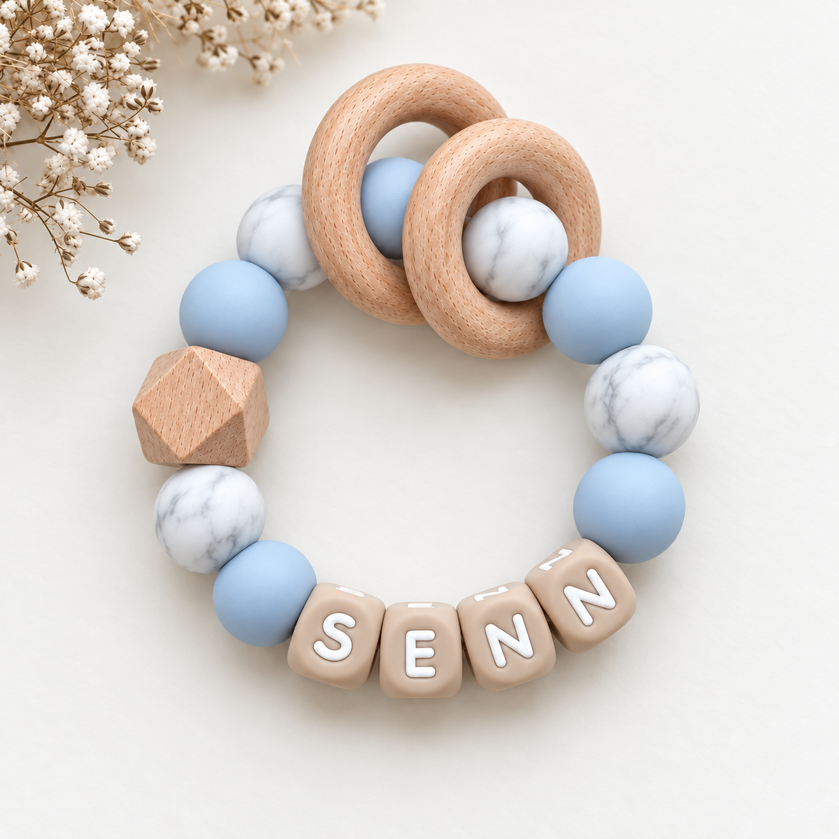
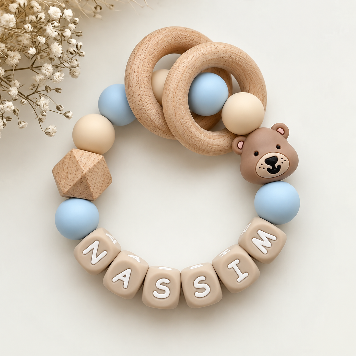
- Main color light blue, supporting color gray, and accent mustard yellow for a modern, fresh combination.
Keep the accent deliberately small. A few beads in a striking color, or one bead by the name, is enough. If you use the accent too often, it loses its effect and the pacifier clip quickly becomes cluttered. For a pacifier clip with a name, you can also use the accent to make the letters or the name bead stand out.
Match the colors to the outfit, pacifier, and accessories
You rarely wear a pacifier clip alone: it hangs from clothing and the pacifier is visible when the clip is in view. Therefore, choose colors that form a cohesive whole. Neutral shades such as white, beige, gray, and soft pink suit almost any outfit. Brighter colors look best on solid-colored clothing.
Keep three points in mind:
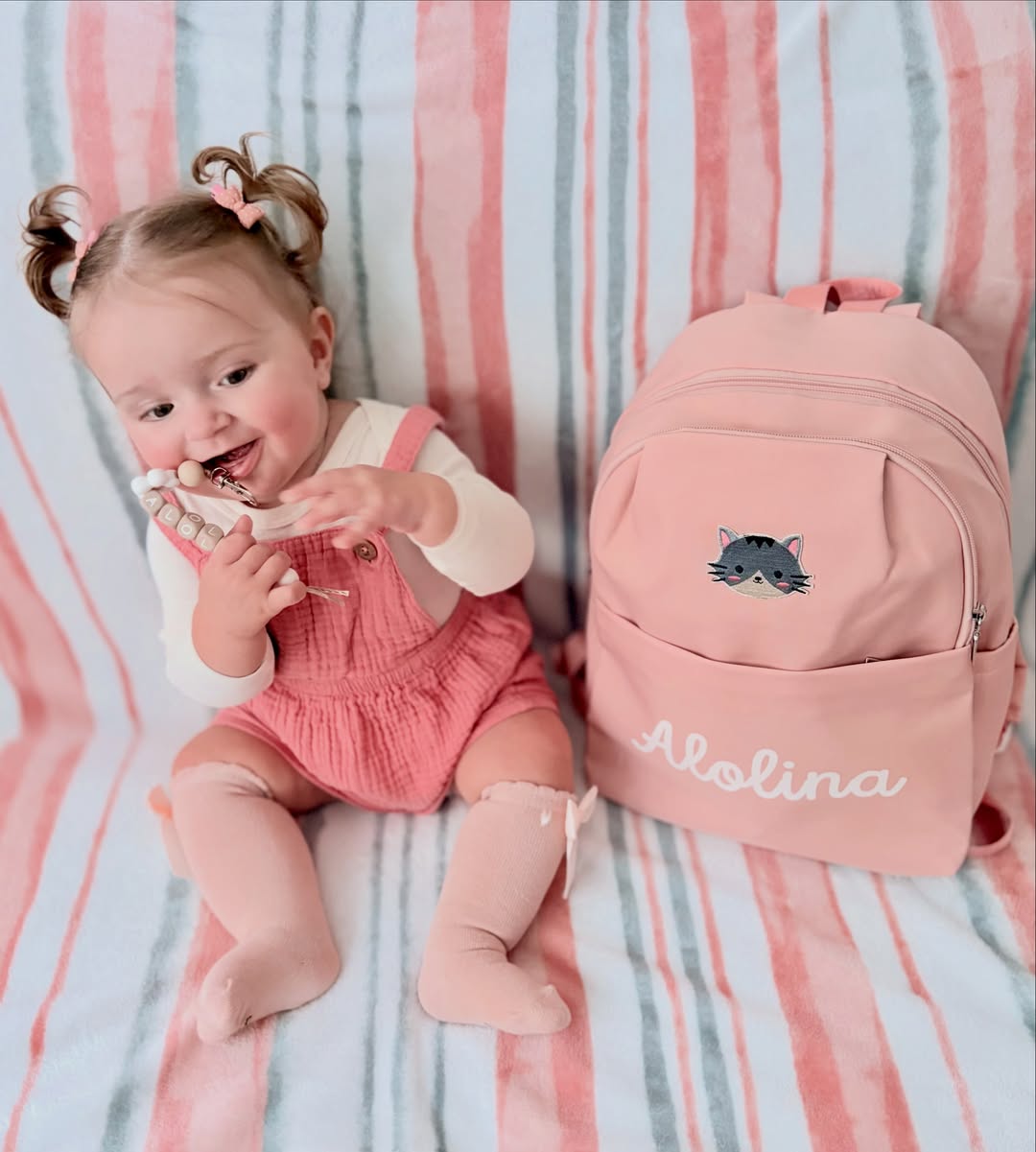
- Clothing: if your child often wears striped or floral clothing, choose a calm pacifier clip in a color that already appears in the pattern.
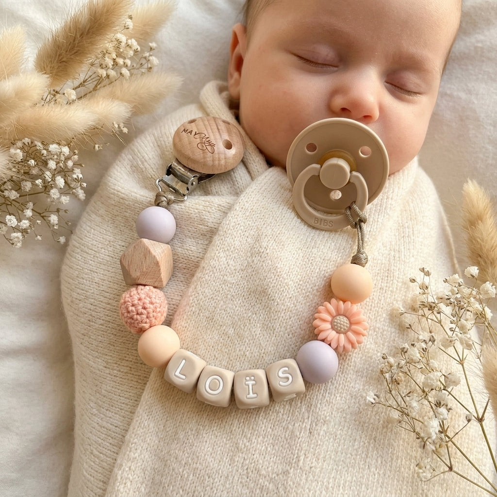
- Pacifier: pick a color from the pacifier and incorporate it into the clip, for example, a soft pastel shade for a BIBS pacifier in the same shade. This makes the pacifier and clip look like a matching set.
- Accessories: think of a comforter, teething ring, or diaper bag. A few repeated colors create a cohesive look without everything having to be identical.
Tip: choose a pacifier clip in two neutral shades with one subtle accent color. This makes it easy to combine the clip with almost any outfit and keeps the design looking beautiful for longer.
If you want to assemble a pacifier clip yourself, first look at the colors of the clothing and the pacifier your child uses most. This allows you to build a color combination from the ground up that really works in practice.
Combining pacifier clip colors using color theory
With a few basic principles of color theory, you can more easily choose a combination that works. The color wheel shows which shades complement each other and which bring harmony. While you determined a main color, supporting color, and accent in the previous step, color theory determines how those three relate to each other.
Choose ton-sur-ton for a calm, cohesive look
Ton-sur-ton means using one color in multiple shades, from light to dark. This is the safest way to combine pacifier clip colors, as the beads will never clash. The result looks soft, polished, and suits almost any outfit.
A few examples that work well:
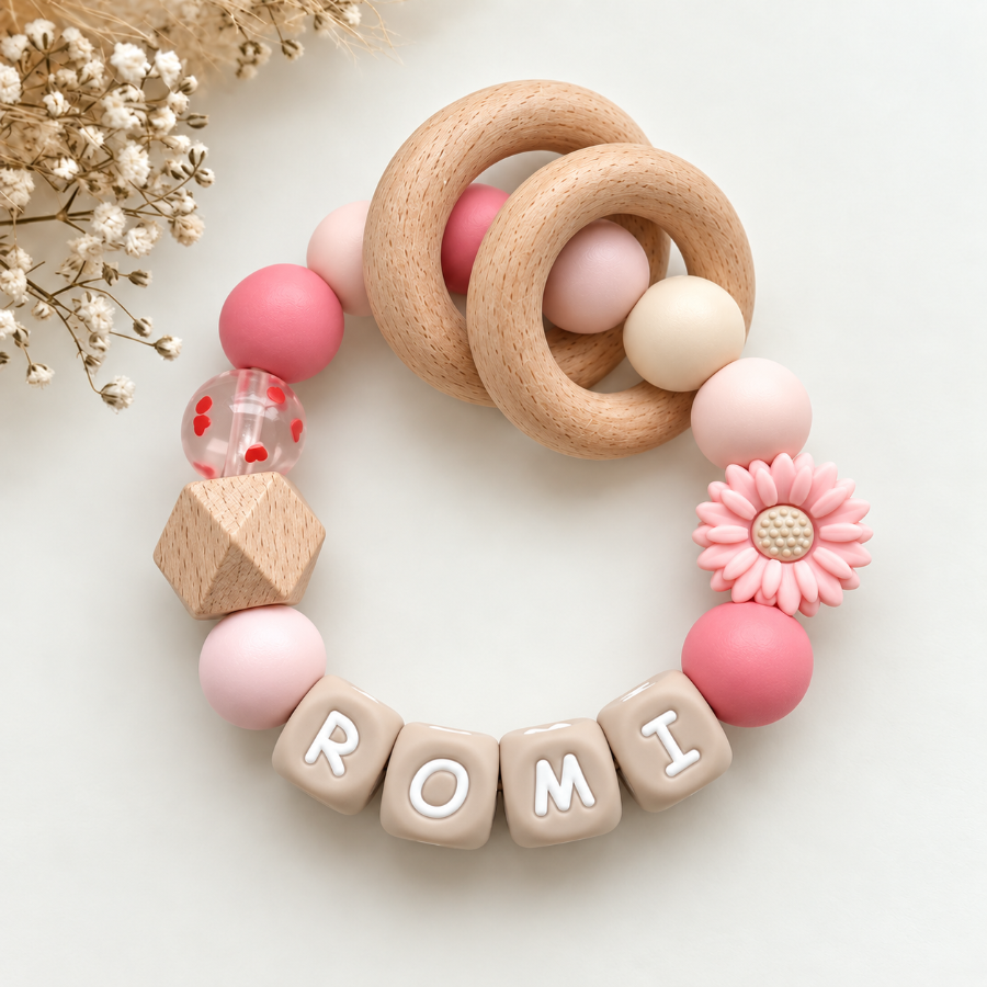
- Soft pink, dusty pink, and raspberry for a warm, girly look.
- Light blue, denim blue, and navy blue for a fresh, bold look.
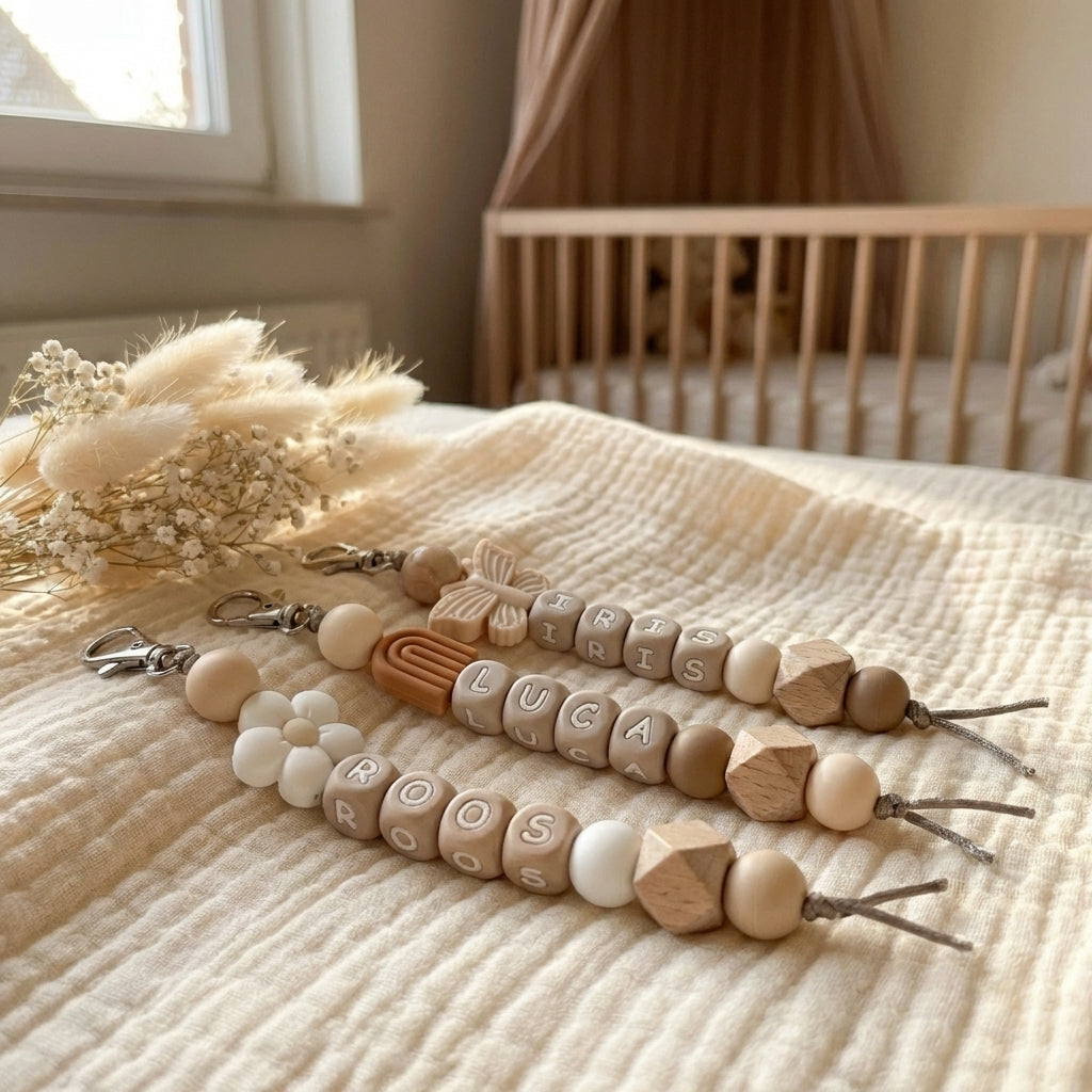
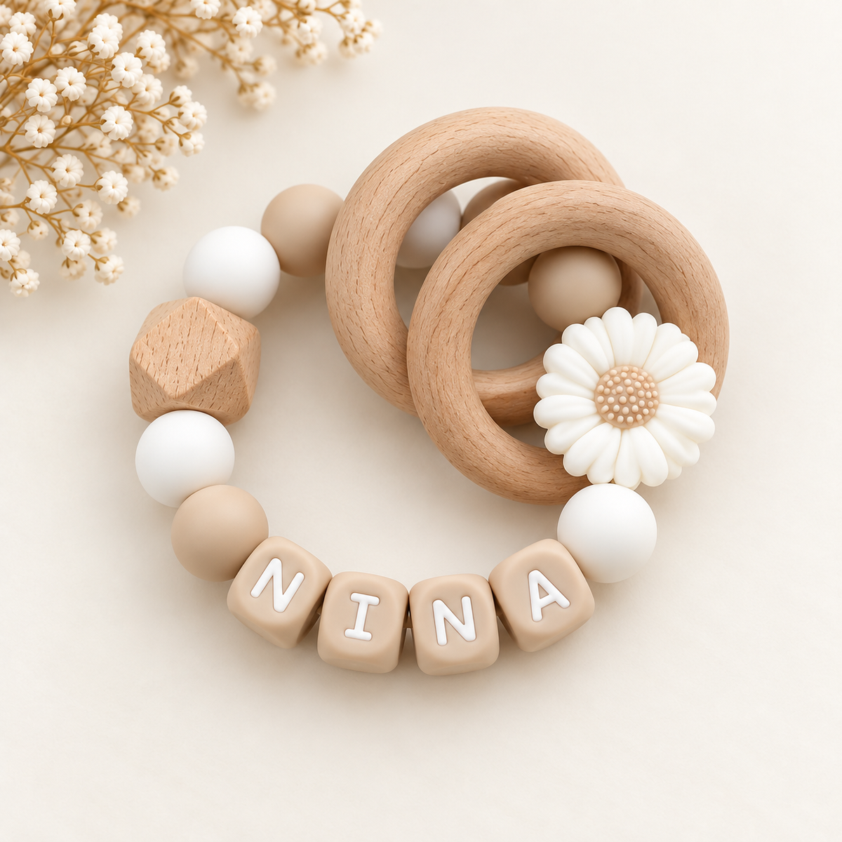
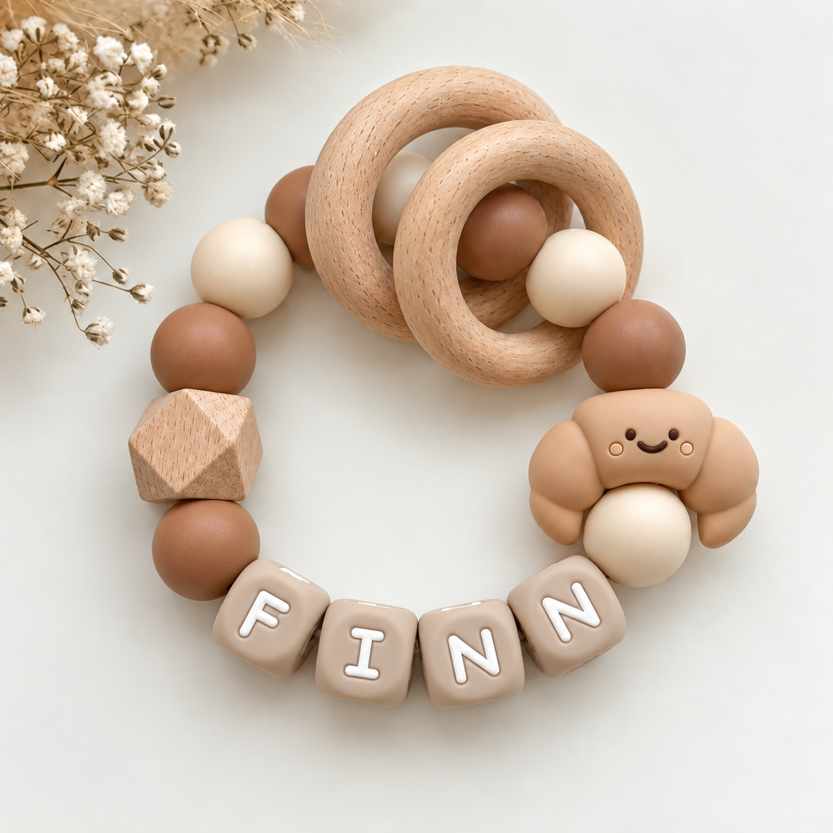
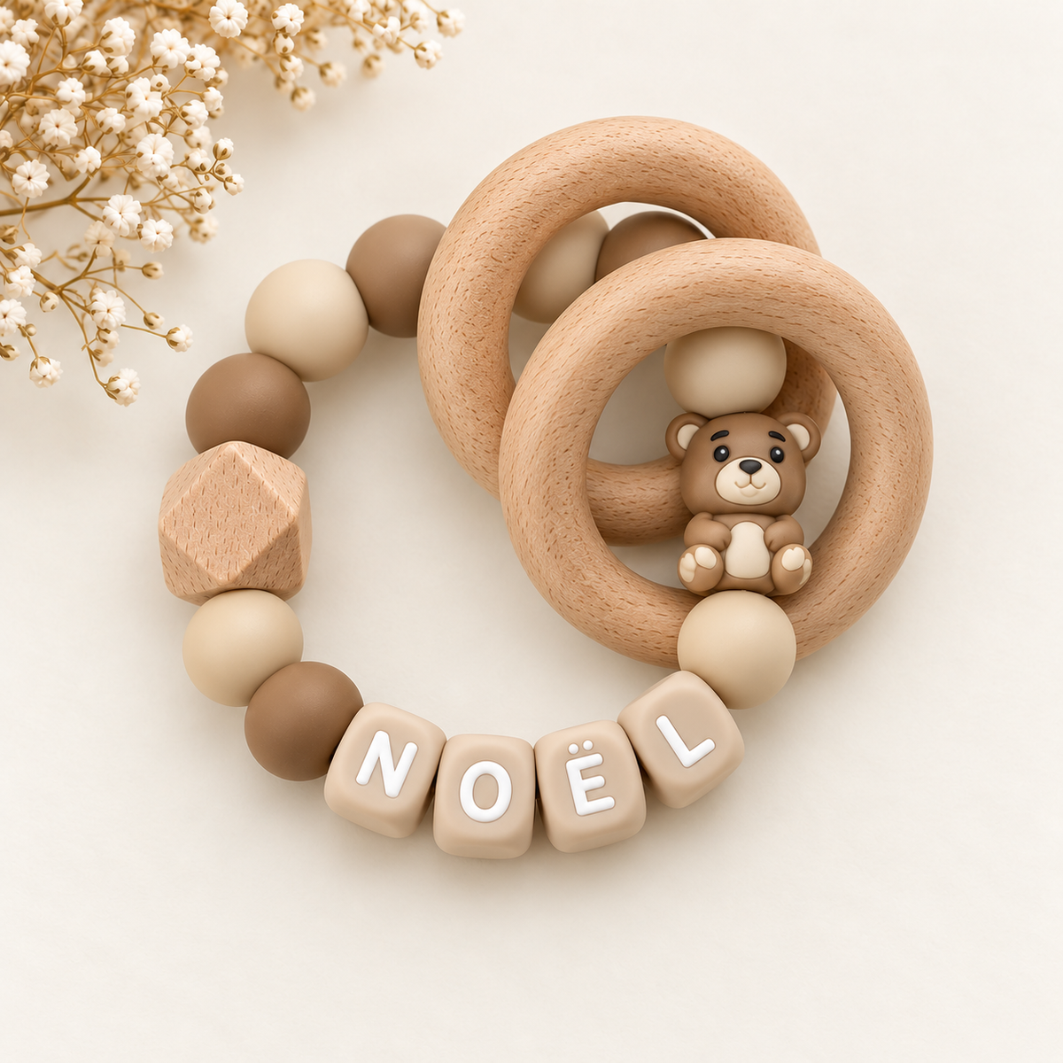
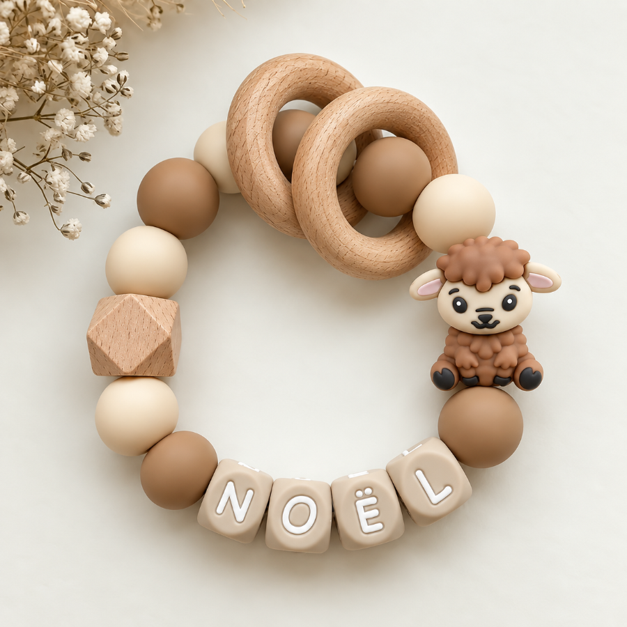
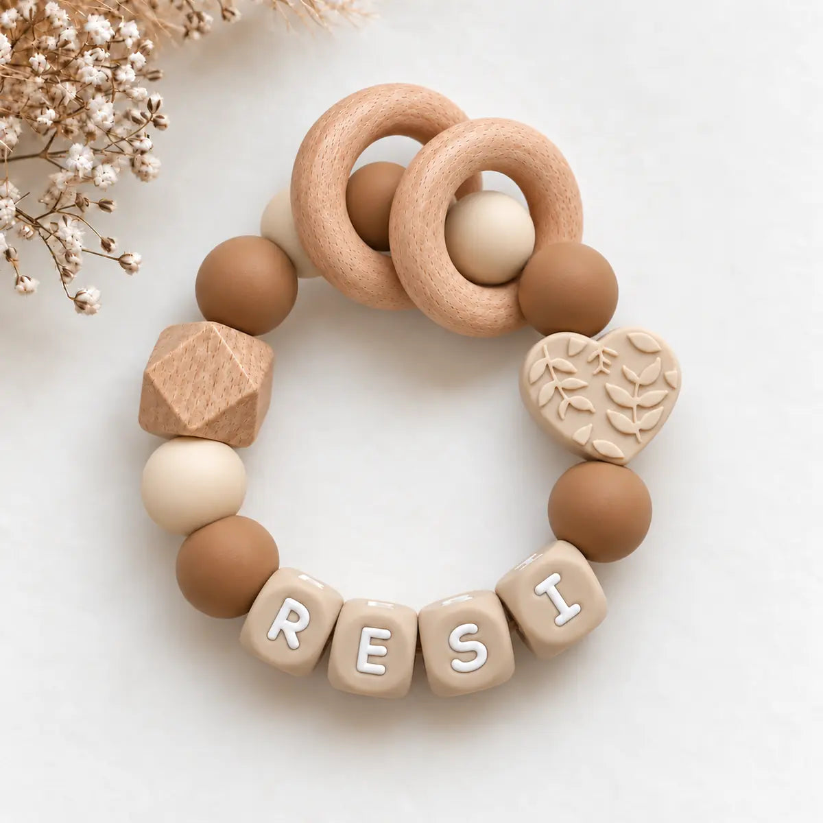
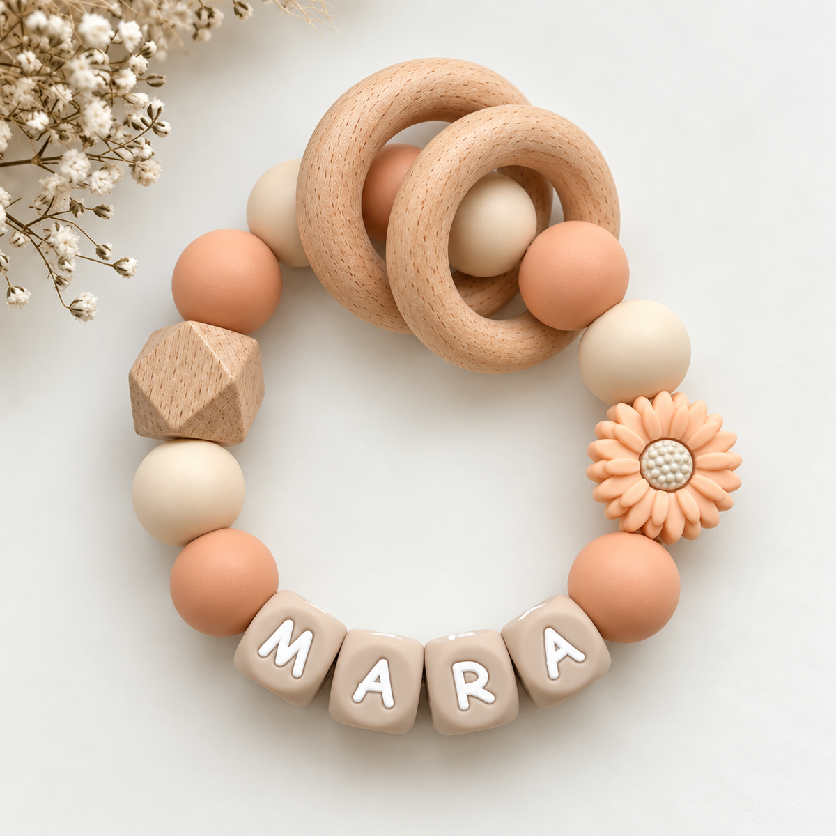
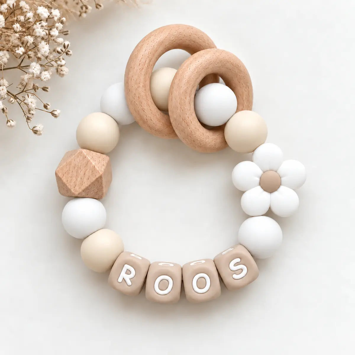
- Cream, sand, and taupe for a minimalist, neutral result.
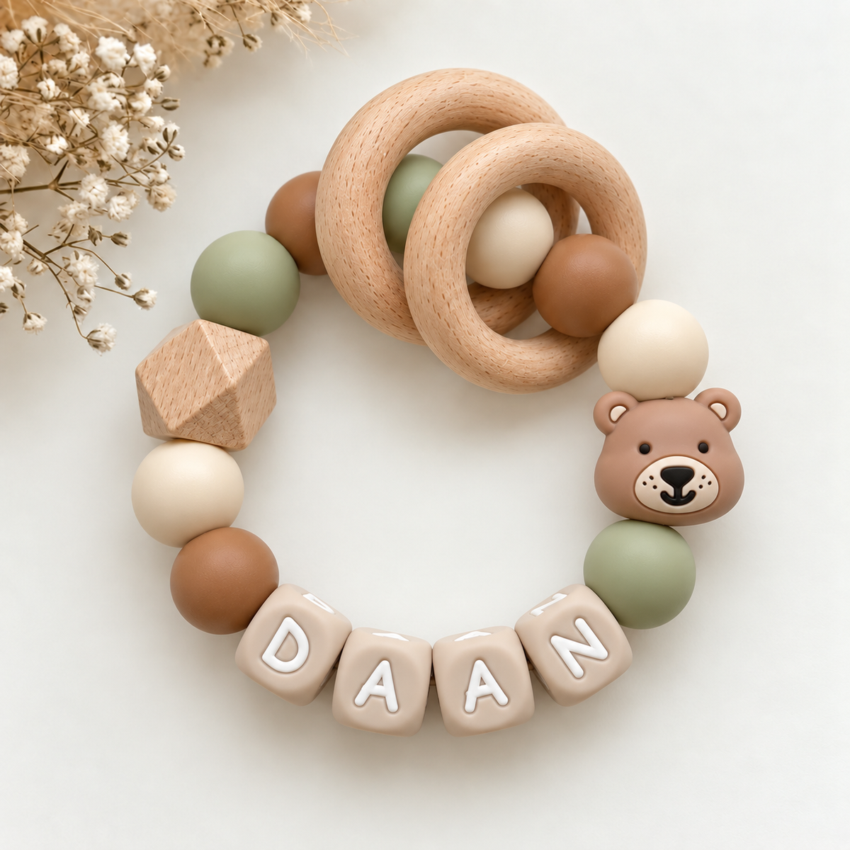
- Sage green, moss green, and dark green for a calm, natural atmosphere.
Because the contrast between the beads is small, a ton-sur-ton design can quickly look flat. Avoid this by varying the texture: combine matte, shiny, and wooden beads in the same color family, for example. Add a small accent in white or gold, and the pacifier clip will have just enough depth without losing its calm character.
Combine complementary or analogous colors for more contrast
If you want a pacifier clip that stands out more, choose colors based on their position on the color wheel. There are two useful methods: analogous for a soft transition and complementary for clear contrast.
Analogous colors are next to each other on the color wheel, such as yellow, orange, and terracotta, or blue, green, and turquoise. They flow naturally into each other and create a vibrant yet harmonious look. This is ideal if you want more color than ton-sur-ton but are not looking for a busy appearance.
Complementary colors are directly opposite each other and enhance one another. Think of blue with orange, green with pink, or purple with yellow. This creates a striking, playful pacifier clip. Use one color as the main color and the opposite as a small accent, for example in a ratio of approximately 70 percent to 30 percent.
A few practical tips to keep contrast manageable:
- Choose pastel versions of complementary colors, such as mint and peach, for a softer look.
- Place neutral beads in white, beige, or gray between bright colors to create a resting point.
- Limit the number of contrasting colors to two, so the eye can rest.
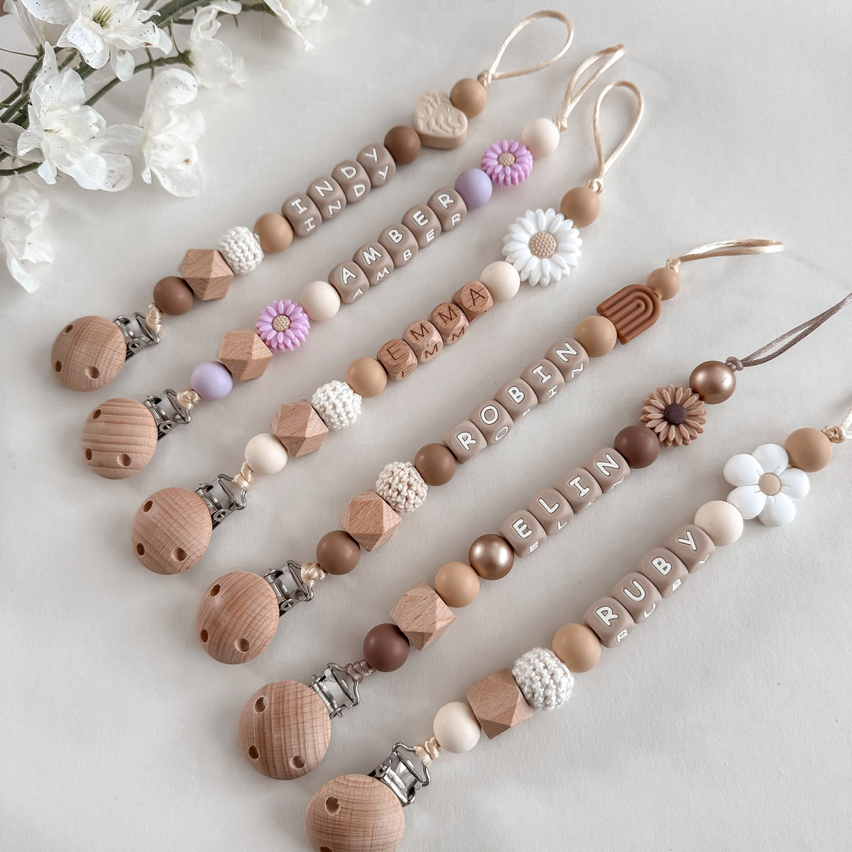
Want to put this theory into practice right away? In May Mays' collection of pacifier clips with names, you'll see dozens of color combinations side by side, from subtle tone-on-tone to playful contrast. This way, you can quickly discover which look suits your child.
Which color combination suits the desired style?
The best color combination for a pacifier clip is the one that suits the look you are going for. Color theory gives you the rules, but your style determines how you apply them: calm and minimalist with neutral tones, or striking with pastels, earth tones, or bright colors.
Neutral tones for a timeless and minimalist look
Neutral colors such as white, cream, beige, sand, light gray, and taupe form the safest and most timeless base for a pacifier clip. They match almost any outfit, look great in photos, and are ideal if you want a pacifier clip with a name that will still suit a second child or work as a baby shower gift.
Because neutral tones offer little contrast, texture works as an extra layer here. A matte bead next to a shiny or faceted bead, or a smooth bead next to a textured one, adds depth without introducing a new color. This prevents the design from looking flat or boring.
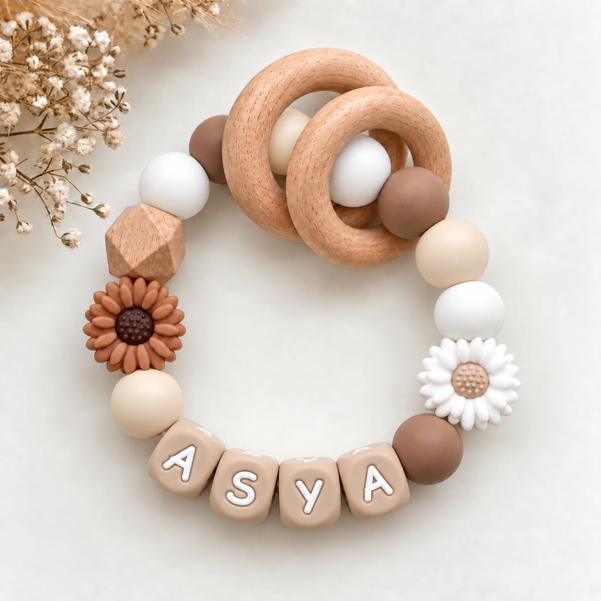
- Choose a light main color, such as cream or white, and a slightly darker accent color, such as sand or taupe.
- Add a small accent in soft gray or warm beige for a subtle transition.
- Limit the number of colors to two or three for a calm, minimalist look.
Pastels, earth tones, or bright colors for a striking look
If you want the pacifier clip to really stand out, choose a clear color direction. Each direction has its own character and requires a different approach.
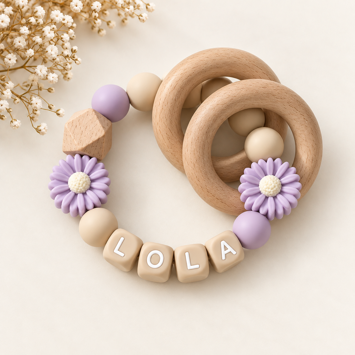
- Pastels: soft pink, sage green, baby blue, and lilac give a soft, cheerful look. Combine them with white or cream so the colors stay fresh and don't become too sweet.
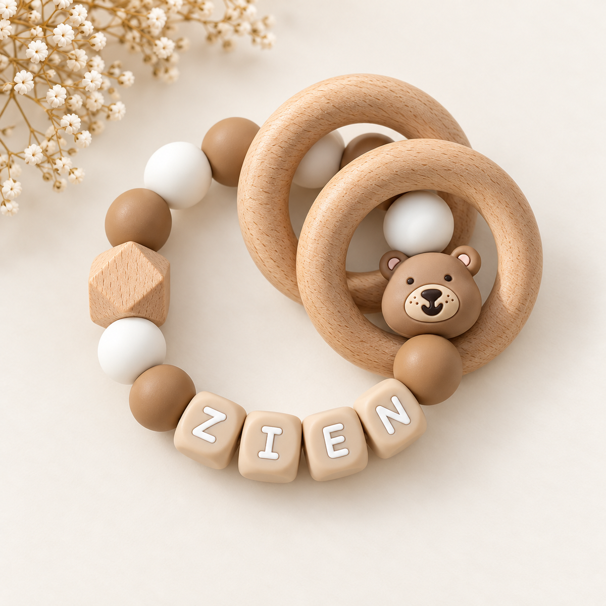
- Earth tones: terracotta, moss green, ochre, and warm brown create a modern, natural atmosphere. They pair beautifully with neutral tones and suit linen and cotton clothing.
- Bright colors: coral, yellow, cobalt blue, or fuchsia make the pacifier clip playful and energetic. Use one as an eye-catcher and keep the rest calm, for example with white or light gray.
A smart rule of thumb: the brighter the color, the smaller its proportion in the design. A bright bead as an accent adds character, while an entirely bright combination can quickly become overwhelming.
Unsure between two styles? Start with a neutral base and add one pastel, earth, or bright color as an accent. This way, you maintain control over the overall impression.
If you want to experience these combinations without having to guess, check out May Mays' collection of pacifier clips with names. You'll find handmade designs in neutral, pastel, and earth tones, which you can also customize with your child's name.
This way, you not only choose a color combination that suits your style, but also a pacifier clip that feels personal and looks great with every outfit.
How to make a pacifier clip with beads visually balanced
A pacifier clip with beads is balanced when the eye finds rest: there is one clear main color, a limited number of shapes, and a recognizable rhythm. If you determined your style in the previous step, it is now all about the execution. How do you arrange those colors and beads so that the whole looks polished instead of cluttered?
Vary color, shape, and material without making the design busy
The rule of thumb is: vary a maximum of two of the three elements at the same time. Alternate color and shape, but keep the material the same. If you play with material, stay close to one color family. This way, there remains cohesion, even though you see different beads.
Practical combinations that work well:
- Color and shape: round beads in soft pink, alternating with a few stars or hearts in the same shade or in white.
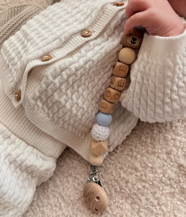
- Color and material: silicone beads in sand and beige, complemented by wooden beads in a slightly warmer natural color.
- Shape and material: only neutral shades, but with a mix of matte silicone and smooth wood.
Also keep an eye on the size. Beads of different sizes add depth, but a cord with too many sizes at once looks cluttered. Choose a base size for the majority of the cord and use one or two larger beads as an eye-catcher. Also pay attention to safety: a pacifier cord must meet the European standard EN 12586, so choose beads and a length that comply with it.
Use color distribution and repetition to guide the eye through the design
Repetition is the simplest way to create harmony. Use each color at least twice, so that no single bead looks like an isolated addition. An accent color that only appears once will quickly look out of place. If it reappears in three or four places, it will look intentionally chosen.
A well-known distribution is the 60-30-10 rule, which you can translate into the number of beads:
- 60 percent main color, for example soft gray or cream.
- 30 percent supporting color, for example sage green or dusty pink.
- 10 percent accent, for example gold or terracotta.
Also create a deliberate rhythm. A pattern such as large, small, small, large gives the design a regular cadence. If you want a calmer look, spread the accent beads evenly along the length. If you want a clear focal point, concentrate them near the clip or in the middle.
Finally, lay the cord flat and scan it with your eyes from left to right. If your gaze jumps somewhere, that is where the balance is off. Replace that bead with a shade that better suits its neighbors. This gives a pacifier cord with a name a finished look, even when you put the colors together yourself.
Combining pacifier cord colors: from initial idea to final design
A good pacifier cord starts with a plan and ends with a critical check. If you first choose a palette, lay the beads next to each other and assess the result in daylight, you prevent the design from looking different in real life than in your head. This applies both to a pacifier cord you put together yourself and to a pacifier cord with a name that you design at a webshop like May Mays.
Create a color palette beforehand and test beads next to each other
A color palette of three to four shades is enough to make a pacifier cord cohesive. First choose your main color, add a supporting color that calmly suits the main color and then determine one subtle accent. This keeps things clear, even if you come across many beautiful beads.
Then lay all the beads in the order they will go on the cord. This way you immediately see if the proportions are correct. A table with a neutral background, such as a white sheet of paper, works best, because a colored surface affects how you see the shades.
Pay attention to these points during testing:
- Does the main color suit the colors of the pacifier and the clothes you often wear or use?
- Is the accent really an accent, and not as strongly present as the main color?
- Are the color transitions smooth, or does one bead unintentionally stand out?
- Do the letters of the name have enough contrast with the beads around them, so that the name remains clearly legible?
If necessary, take a photo of your arrangement. On a screen you often see what is wrong faster than with the naked eye.
Check the look in daylight and adjust colors where necessary
Always assess your design in natural daylight, because artificial light distorts colors. Warm lamp light makes white and cream look yellower, while cool light makes pastel pink and light blue look paler. In daylight you see how the colors actually look during a walk or in the stroller.
View the design from a distance of about one meter. This gives you an impression of how others see the pacifier cord. If the design then falls apart or looks too dark, a small adjustment often helps:
- Replace a bright bead with a softer shade if the whole thing becomes too busy.
- Add a light bead if the design feels too heavy or too dark.
- Swap the position of two beads if two strong colors draw too much attention from each other.
- Remove one color when working with more than four shades.
During the final check you also look at the practical picture: the cord must be easy to wear and meet the European safety standard EN 12586. A beautiful design is only finished when it is also safe. If you are satisfied with the color and proportions, you know that the pacifier cord is ready to be made.
Frequently asked questions about combining pacifier cord colors
How many colors are best to use in one pacifier cord?
It is best to use two to three colors, optionally complemented by a neutral shade such as white, cream, or gray. This keeps the pacifier cord calm and recognizable, while leaving enough room for personality.
A proven layout is a main color for about half of the design, a supporting color for about a third and a subtle accent for the rest. Think of soft pink as a base, cream as support and a little gold or sage green as an accent. If you still want to use more colors, choose shades from the same color family, for example three shades of blue. This keeps the design cohesive, even though it counts multiple colors.
Which colors go with almost any outfit?
Neutral colors such as white, cream, beige, gray, and soft earth tones go with almost everything. They ensure that the pacifier clip does not clash with striped, printed, or brightly colored clothing.
- White and cream: fresh and suitable for both pastel colors and dark clothing.
- Sand beige or taupe: warm and timeless, beautiful with earth tones and denim.
- Gray: neutral and modern, a safe choice for both boys and girls.
- Sage green or dusty pink: soft enough to combine with many other colors.
Not sure? Choose a neutral base and add one color that you often see in your child's wardrobe. This way, the pacifier clip matches most outfits without looking boring.
How do you combine contrasting colors without making the pacifier clip look too busy?
Let one color clearly dominate and use the contrast color sparingly. A ratio of approximately 70 percent base color and 30 percent contrast keeps the overall look tidy.
- Place neutral beads between the contrasting colors so they do not clash directly.
- Choose muted versions of opposite colors, such as mustard yellow with teal blue instead of bright yellow with royal blue.
- Repeat the contrast color in two or three places, for example at both ends and in the middle.
By repeating the contrast color, you create rhythm instead of chaos. The eye gets resting points and the design looks intentionally composed.
What else should you pay attention to with a homemade pacifier clip besides color?
Safety always comes before appearance. A pacifier clip must meet the European standard EN 12586, which sets requirements for length, strength, and attachment, among other things.
- Length: maximum 22 cm, measured in its ready-to-use form, to prevent strangulation.
- Materials: use beads made of untreated wood or food-grade silicone, without small parts that can come loose.
- Cord and knots: choose a strong, high-quality cord and carefully check the knots and finish.
- Attachment: use a secure clip without sharp edges or loose parts.
- Inspection: regularly inspect the pacifier clip for wear and replace it if damaged.
Also keep in mind that a pacifier clip is never intended for use during sleep. Only use it under supervision, for example in a stroller or on your lap.
Want to be sure everything is correct? At May Mays, you put together your own pacifier clip with colors of your choice. It is handmade in the Netherlands and meets the safety standard EN 12586. This way, you combine your favorite colors with the assurance of a safe end result.



Leave a comment
This site is protected by hCaptcha and the hCaptcha Privacy Policy and Terms of Service apply.